Consider how podcasting platforms display your podcast artwork to make sure you get your design right.
The podcast market is booming. As of late 2019, there were more than 800,000 active podcasts on Apple Podcasts. Now that it has moved into the mainstream after years on the fringes, everyone is diving into podcasting. Established media outlets have embraced it by re-packaging their content for podcasts. People with particular enthusiasm for any subject see it as an affordable and relatively simple way to share their passion. And many people who maybe just like the sound of their own voice a bit too much can put themselves out there. All they need is a semi decent mic.
The most important part of podcasting is, obviously, the podcast itself. The sound, the content, and all the elements of the auditory experience.
But when it comes to getting an audience the visuals of a podcast l. This is how you get noticed in a sea of 800,000 others. If you get it wrong you can actually be penalised. Don’t meet Apple’s quality requirements, for example, and you won’t meet the standard to be a featured podcast. They may even remove your artwork entirely.
So how do you do stand out?
It’s important to understand where the visuals come into play. There are a lot of different podcast platforms and it’s worth looking at the major players to see how they use your artwork. You can go as in depth as you want here by researching many providers, but Apple Podcasts (iTunes) and Spotify should be your starting point, as they are the market leaders by some distance. Deezer, Castbox, and Google Podcasts trail them but can be worth checking out.
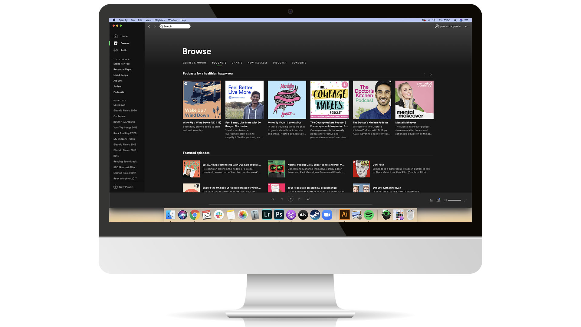
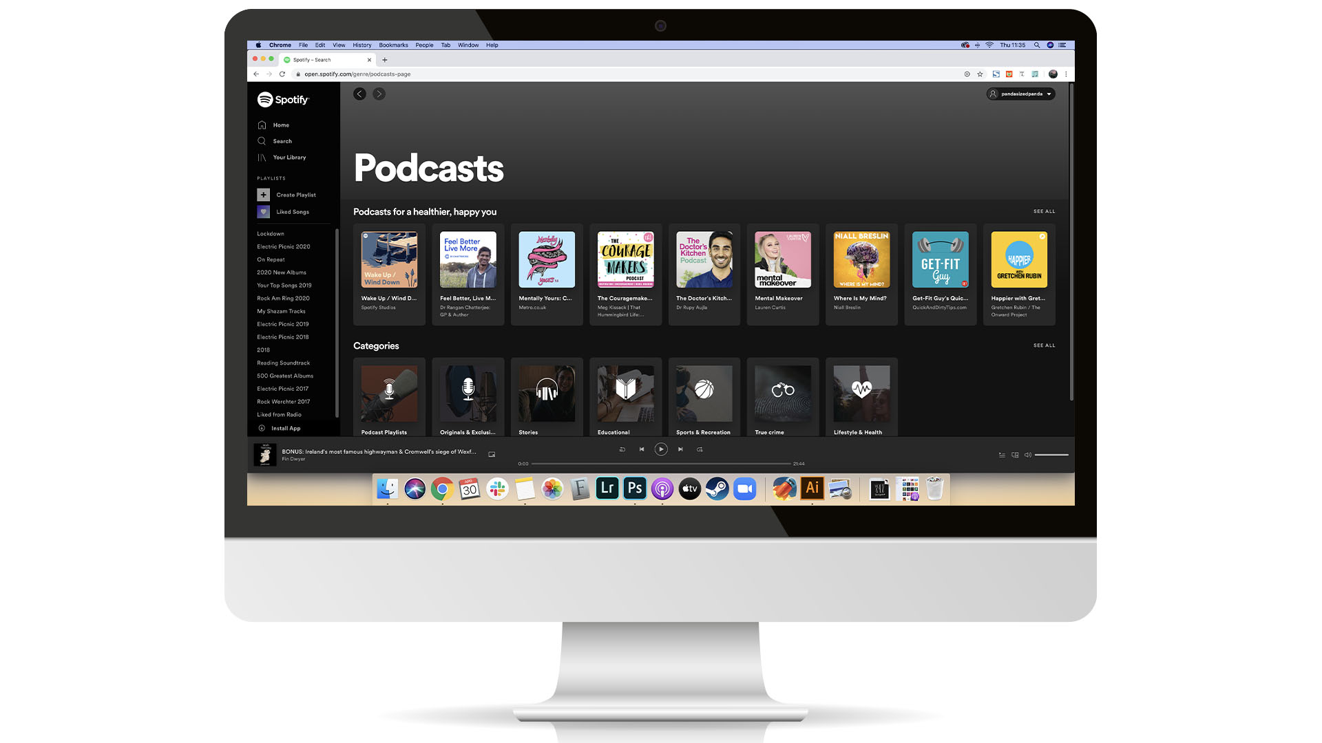
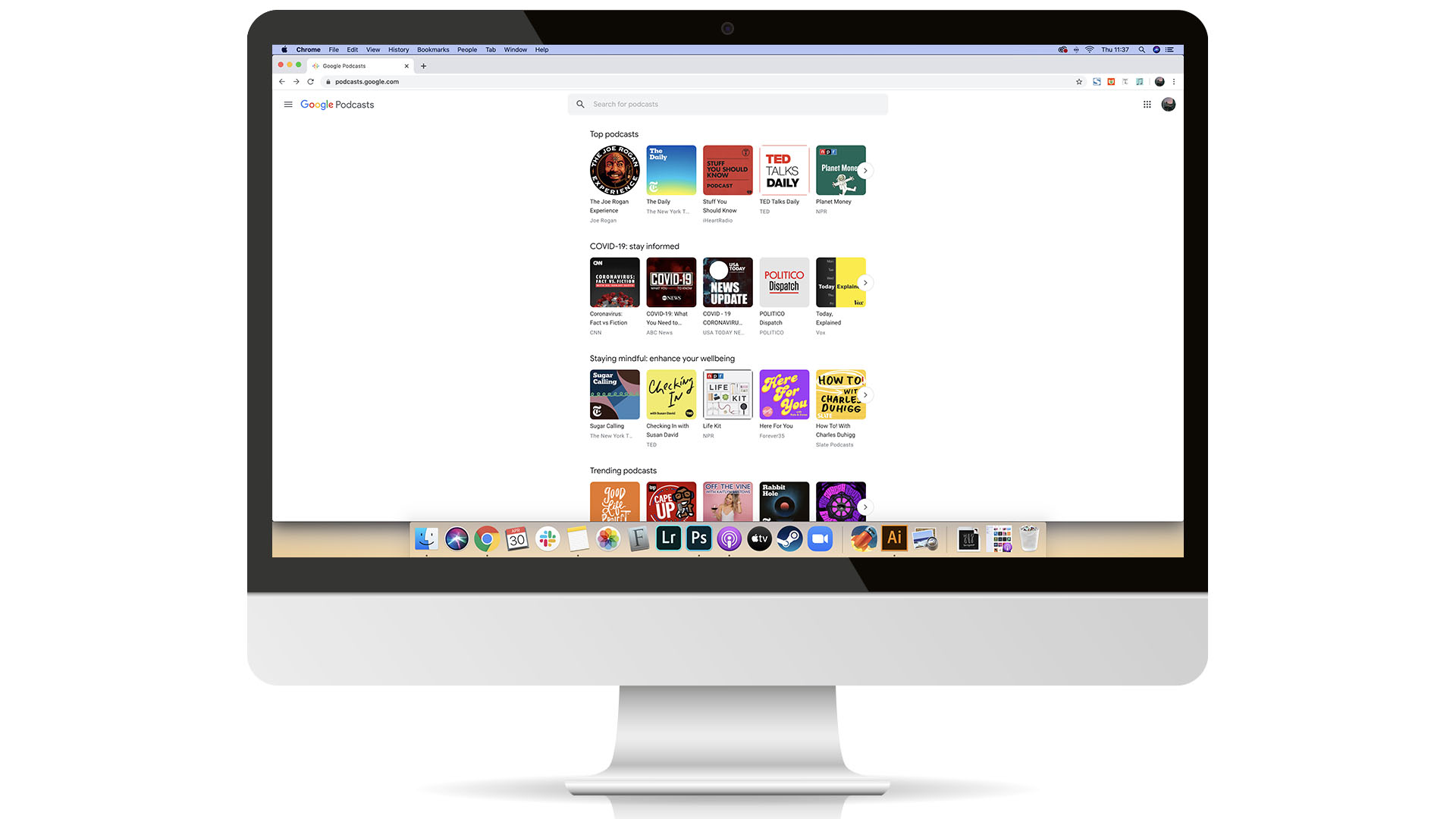
Starting with desktop here’s how each platform will show your podcast.

The Apple Podcasts and Spotify desktop apps give plenty of space for your image. Through their main browsing pages or search results pages your image will be shown on a large scale. When it comes to looking for podcasts on your browser instead of an app you will be afforded less room. The Spotify Web Player and Google Podcasts examples show this. In general though, the images are large and by far the biggest feature on each platform when browsing podcasts, and as such, your biggest chance to make an impression.
This is however where a lot of people go wrong. Podcast creators can get caught up with desktop, because that is what they are seeing when creating their podcast and uploading episodes. While your images can look really great on desktop and their size affords you the possibility to include plenty of information and more intricate designs, this is only a very small amount of your audience. When it comes to podcast listening, mobile is king.
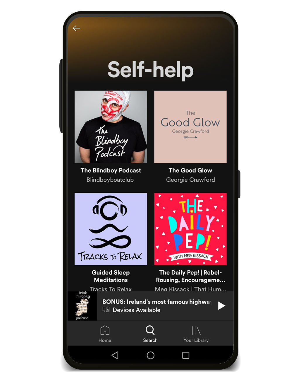
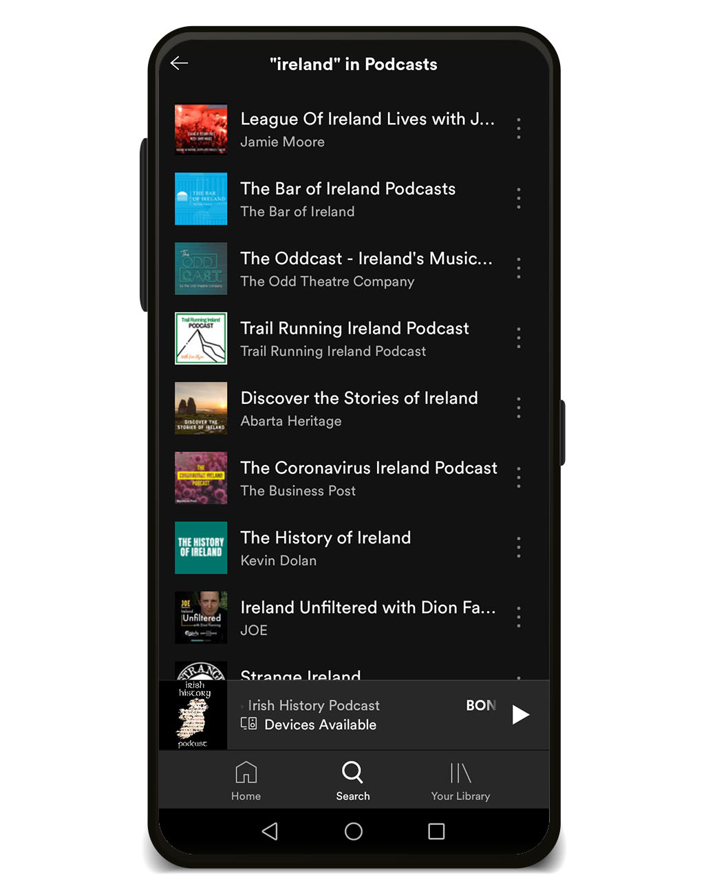
Looking at mobile here are some examples of how your podcast will look.

When browsing categories on the mobile Spotify app your images are still given huge priority and a well designed image here will grab peoples attention. Where we run into trouble is on other pages, such as search. Now suddenly, your image is tiny. All of that extra information and intricate design that looked so good on desktop is a barely readable mess. Looking at the Google Podcasts app adds an even more annoying issue in a large subscribe button being placed over the lower right part of your artwork.
Nothing here is unmanageable. What’s important is that you have all of this information before you dive into creating your artwork. Once you consider all of the places it will appear you can make the right decisions for your podcast and your artwork.
What those right decisions are is completely dependent on your podcast and what your artwork needs to get across, but there are some general guidelines you can follow:
- Don’t do too much
- We now know that sometimes your artwork will be seen in very small sizes. Think about what’s really important and show only that.
- Font
- The font you choose can be very important for capturing the essence and tone of your podcast. That should not be ignored so be sure to pick something that works for you. But also consider how readable it will be in those smaller mobile sizes. If you can’t read it, you might want to reconsider.
- The competition
- Have a look at the category your podcast is in. When scrolling through, see if you can spot any recurring themes, colours, or stock icons that make everything kind of blend into one. You won’t stand out by doing the same. Be different.
- Consistency
- Once you have your artwork you need to use it. Not just as your podcast cover art, but for your social media and advertising. This is too big of a topic to cover just here, but consistency is a huge part of podcast brand recognition so be sure to work on it.
There are a lot of things to consider when it comes to creating a podcast, but there is no guaranteed right way to do things. What works for others may not for you, but there are steps you can take to give you the best chance to reach an audience. Your artwork can play a big part in that.

